
Introduction
A limited palette is a colour mixing approach that could benefit your studio practice. It is an effective way to simplify mixing for beginners and provide a challenge for experienced artists who find themselves reaching for the same colours repeatedly. Colour mixing can be overwhelming, especially with the wide range of colours offered by most manufacturers. While collecting a wide range of colours can offer many possibilities, reducing the number of colours on your palette can also be a powerful and practical choice.
What is a Limited Palette and why use one?
The use of a limited palette is an age-old technique of choosing a reduced number of paint colours to create a certain range of colour mixes, sometimes surprisingly broad. Limited palettes provide a foundational colour mixing experience by training your eye to see tonal nuances, subtle colour temperature shifts, and to better understand colour relationships and harmony. Consider the possible emotional impact of a palette. Is the colour scheme dark and moody or light and airy?
Using a limited number of colours on your palette can mean fewer tubes of paint to purchase and fewer to take with you when painting en plein air. As practical as this approach can be, it can also be a fun challenge. Experiment, switch up your choices and remain open to discovery.
How do I get started? How many colours and how should I choose?
Starting with a simple three-colour limited palette can help build confidence in colour mixing before gradually expanding your palette. A traditional way to set up this simple palette is to begin with a triad (a set of three) of primary colours: a yellow, a red, and a blue. A quick way to improvise and explore additional palettes is to choose different primary triads or replace just one colour at a time. Try switching the red to a warmer or cooler version and observe how this affects your mixes. There are a myriad of combinations to try.
In this article we will explore three limited palettes based on different primary triads. Our first two are influenced by Rembrandt van Rijn (1606–1669) and John Singer Sargent (1856–1925), respectively. Our third palette is inspired by the invention of acrylics and explores modern colours that became available to artists from the mid to late 20th century onwards. To express these palettes visually, corresponding colour wheels were painted.
Why a colour wheel?
Colour wheels are an organised way to show the mixing potential of three colours. While they do not show every possible mixture, they provide a useful snapshot of what can be achieved with a limited palette. The wheels primarily show colour-to-colour mixing results leading to the creation of orange, violet, and green secondaries. In addition, we have structured the wheel to include opaque and translucent applications, as well as tints created by adding white.
Colour potential can shift depending on technique. An opaque application straight from the tube, a translucent glaze allowing the ground or underlying colour to show through, and a tint created by mixing with white will all produce different results, as demonstrated in these colour wheels.
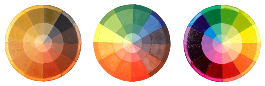
Left: An earth tone triad inspired by Rembrandt.
Center: A bright triad in watercolor inspired by Sargent.
Right: A vibrant triad of modern synthetic organic pigments.
Rembrandt: Bone Black, Yellow Ochre, a natural earth red, and Titanium White
A 2006 publication by the National Gallery in London, Art in the Making: Rembrandt, includes a detailed section on the artist’s palette by Ashok Roy and Jo Kirby. The authors describe his staple colours as lead white, bone black, and earth pigments such as ochres, siennas, and umbers. They highlight Rembrandt’s creative use of a limited number of pigments.
“The range of pigments Rembrandt employed involves no arcane knowledge, no secret formulae, but instead falls firmly within the mainstream of painting practice in Holland in the seventeenth century. His palette is entirely made up of pigments that were widely commercially available…”
“…the total number of pigments he regularly used was not large, especially if the natural earth colours which contribute substantially to the palette were treated as a single group; but the way in which they were used, combined with the complexities of pigment mixture and elaborate paint layer structure, gave Rembrandt access to an extremely impressive range of effects…”
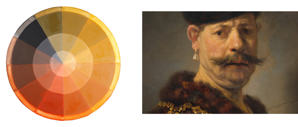
Left: Williamsburg Oils Earth Tone Colour Wheel
Right: A Polish Nobleman by Rembrandt van Rijn
We find this approach incredibly inspiring. An oil painter creating extraordinary works without the vast array of pigments available today encouraged us to develop our first limited palette using Williamsburg Artist Oils, informed by Rembrandt’s use of Bone Black, Lead White and earth tones.
Williamsburg Oils: Ivory Black, Yellow Ochre Domestic, Italian Pompeii Red, and Titanium White
- Ivory Black acts as the “blue”, creating cool, dark mixtures.
- Yellow Ochre lends warmth and influences a large portion of the colour wheel.
- Italian Pompeii Red provides warm, rosy tones suitable for skin.
- Titanium White aligns closely with Rembrandt’s original palette.
This palette is ideal for exploring warm, muted tones and subtle tonal transitions—from greenish yellows to deep browns—resulting in a cohesive, golden overall effect.
Alternatives:
- QoR Watercolours: Ivory Black, Yellow Ochre, Venetian Red, Titanium White
- GOLDEN Heavy Body Acrylics: Bone Black, Yellow Ochre, Red Oxide, Titanium White
Sargent: Prussian Blue, Vermilion, Cadmium Yellow, and Zinc White
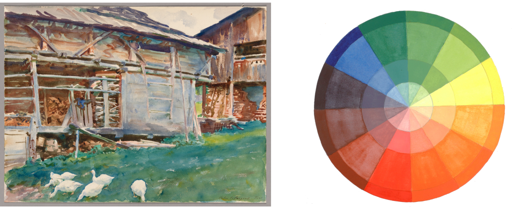
Left: Woodsheds, Tyrol | The Art Institute of Chicago
Right: QoR Watercolours Bright Triad Colour Wheel
John Singer Sargent was a prolific painter in both oil and watercolour. Research from the Art Institute of Chicago (2018) identified a range of pigments used in his watercolours, including Prussian Blue, Vermilion, Cadmium Yellow and Zinc White.
From this research, we created a simplified triad:
QoR Watercolours: Prussian Blue, Cadmium Red Light, Cadmium Yellow Light, Chinese White
- Prussian Blue produces rich cool blues and greens.
- Cadmium Red Light approximates Vermilion with a bright, warm tone.
- Cadmium Yellow Light mixes clean, vibrant greens with blue.
- Chinese White (Zinc White) offers subtle opacity while maintaining luminosity.
This palette reflects traditional watercolour techniques—transparent washes and layered glazes—while still allowing for more opaque applications if desired.
Alternatives:
- Williamsburg Oils: Prussian Blue, Cadmium Red Vermilion, Cadmium Yellow Light, Titanium White
- GOLDEN Heavy Body Acrylics: Prussian Blue Hue, Cadmium Red Light, Cadmium Yellow Light, Zinc White
Modern Pigments: Benzimidazolone Yellow, Quinacridone Magenta, Phthalo Blue

Modern Pigments Vibrant Triad Colour Wheel
Our final palette explores modern synthetic organic pigments developed alongside acrylic paints in the 20th century. These pigments—Phthalocyanines, Quinacridones, and Benzimidazolones—offer exceptional brightness, clarity and consistency.
GOLDEN Heavy Body Acrylics:
Benzimidazolone Yellow Medium, Quinacridone Magenta, Phthalo Blue (GS), Titanium White
- Benzimidazolone Yellow produces warm greens and oranges.
- Quinacridone Magenta creates vibrant purples and luminous mixes.
- Phthalo Blue offers intense tinting strength and clean green mixtures.
These pigments are known for their strength, vibrancy and reliability in mixing. Unlike natural pigments, they are manufactured for consistency, resulting in predictable colour behaviour.
A useful exercise is to swap one colour at a time—for example, replacing the yellow or adjusting the blue shade—to observe how the palette shifts.
Conclusion
Whether you have been painting for decades or are just beginning your journey, experimenting with limited palettes can greatly benefit your studio practice. It helps you better understand individual colour characteristics, improves mixing confidence, and encourages more intuitive decision-making at the easel.